Celtic Connections Installation with Pufferfish Ltd

1016359_10102296579687751_325721798_nAs part of my current project, I am working with Pufferfish Ltd to evaluate spherical displays in public spaces.  One of our exciting installations combines my research and my love of Scottish music.  We’re working with Celtic Connections to install the PufferSphere display in the concert hall for the whole opening weekend of the festival.  It’s an exciting place to be and also my first public engagement since starting my SICSA Fellowship.  It’s been a wild ride but we’ve pulled it off with style.

The official news item…

Computer scientists plan to make Celtic Connection with global project

Visitors to the 21st Celtic Connections festival will have the chance to hold the world in their hands at Glasgow Royal Concert Hall from today (Thursday 16 January).

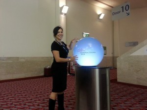
Researchers from the University of Glasgow’s School of Computing Science have teamed up with Edinburgh-based display developer Pufferfish Ltd to create an eye-catching illuminated globe which will provide information on 25 of the festival’s top acts.
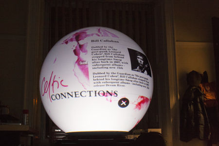
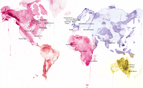
Celtic Connections globe

Celtic Connections image

A computer-controlled display will project a high-resolution image of a world map onto the 600-mm spherical display’s touch-sensitive surface. Users can ‘spin’ the image, which is marked with the locations of artists’ home cities, and tap on artists’ names to find out more about their work and festival gigs.

In addition to providing an unusual source of useful information to Concert Hall visitors, a set of small cameras placed around the display will provide the research team with feedback on their reactions.

Research associate Dr Julie Williamson, who led the project, said: “This is the result of four months of work to develop the content to show on the PufferSphere display and determine how we could best measure visitors’ responses.

“We’re really interested in finding out more about how technology influences pedestrian traffic in public spaces, a process we call performative interaction. We want to know how long people spend at the display and whether they use it alone or in groups. We wanted to get involved with Celtic Connections because it attracts so many visitors from around the world and we were delighted when they agreed to help.

“We’re planning to continue our research with another public display at the University campus next month.”

Dr Williamson worked on the project with product designer Daniel Sundén and Pufferfish Ltd’s software manager Dr Jay Bradley and sales and marketing manager Ben Allan.


News Release:  http://www.gla.ac.uk/news/headline_302743_en.html


Software Engineering IT – First Lecture

Teams must complete a tower design challenge given limited supplies.

Teams must complete a tower design challenge given limited supplies.

This year I am teaching Software Engineering IT, a masters level software engineering course for students without a previous background in computing science.  This is the first course I have ever taught, and I wanted to bring some of my defining experiences at UC Irvine across to my teaching here at Glasgow.  I was amazingly fortunate to take Software Engineering with André van der Hoek, where I was taught software engineering from a design perspective.  This perspective was core to André’s teaching, and I hope I’ve done it justice here and helped spread this mantra that I stand behind.  Although I have now gone off the HCI and sociology deep end, software engineering was one of my favourite topics as an undergrad and André’s course contributed to my love of research and creativity in my work.

For the first lecture of the class, I wanted to drive home some important points about creativity and problem solving in software engineering.  During the lecture, the class was split into teams to participate in a tower building challenge.
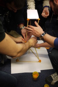
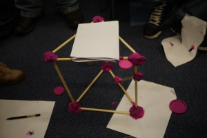
An intermediate design for a tower.

An intermediate design for a tower.

The Challenge

Design the tallest possible tower given the materials.

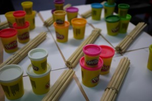
Your tower must be able to support the weight of one large tub of Play-Doh.

Tower will be judged based on functionality (does it support weight?), height, and beauty.

The teams were left with 25 minutes to design and build the best tower possible.  However, the lecture was grounded on some important software engineering concepts that I wanted to highlight with our towers.

Duck Tape?  

I asked the students if they would’ve built better towers if I provided them with the duck tape I had in my box of tricks.  In software engineering, that duck tape is like the library or framework you might have not been aware of or chosen not to use.  In the tower, not using the duck tape as a tool seems silly. In software engineering, use of appropriate tools and frameworks makes an even bigger difference.

What do Towers Look Like?

I also challenged assumptions and design decisions in the tower process to highlight the importance of good requirements.  I changed the challenge at the end by asking for a tower that could suspend from the ceiling.  How many of the designs would still work? What about if when I said tower I really meant bridge?  Would you simply turn the tower sideways as say “this is a bridge” or would you start with a new design?  I wanted to demonstrate that we often re-purpose software and use it in ways it’s not intended because we can, but this leads to lots of headaches down the line.  You wouldn’t just repurpose the tower when it obviously wasn’t fit for purpose, and we shouldn’t do that with software either.  I also touched on the idea that a good tower design might support re-use and extension more easily, which leads to…

Design Patterns for Towers

Towers have design patterns as much a software does.  I demonstrated a simple construction technique for the towers to show the students how much a proven design pattern can improve your final product.  Thus far, I think the best joint for tower building given our material set is to place two dowels end to end, wrap tightly with paper, and secure down with a small amount of Play-Doh.  After showing this technique, we discussed how it might make much stronger and taller towers.  Again, I asked if the students would just augment their design or start fresh given the new knowledge.  Towers have design pattern and so does software, and we’ll be learning and applying them in this course.

I tried to use the tower not only to give a flavour for the level a creativity and reflection I expect during the class, but also to show some hopefully compelling examples of why the intangible or difficult to visualise software pitfalls are important to address in the software engineering process.  I think I am going to really enjoy my first semester of teaching.

Some of the Final Results

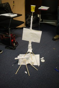
A tower with a flag and a plaza.

A tower with a flag and a plaza.

It turns out that adding “Beauty/Creativity” as one of the tower judging criteria led to some very interesting designs.

A tower with circular paper adornments.

A tower with circular paper adornments.

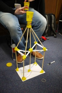
An interesting shape in the middle of the tower.

An interesting shape in the middle of the tower.

A short but strong tower.

A short but strong tower.


Special thanks to André van der Hoek and Alex Baker who not only first exposed me to software engineering as design at UCI in 2006 but who also guided and supported me while preparing for this course.

ICMI2013 – Mo!Games: evaluating mobile gestures in the wild

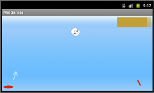
One of the apps was a mobile game where users had to toss marshmallows onto a target using gestures.

One of the apps was a mobile game where users had to toss marshmallows onto a target using gestures.

This year I attended ICMI 2013 in Sydney, Australia. I presented our full length paper entitled Mo!Games: evaluating mobile gestures in the wild. The paper describes an in the wild study of a mobile application that uses head, wrist, and device-based gestures. The goal of the study was to explore how users performed gesture-based interaction in their everyday lives and how they developed preferences for different gesture styles.

Abstract: The user experience of performing gesture-based interactions in public spaces is highly dependent on context, where users must decide which gestures they will use and how they will perform them. In order to complete a realistic evaluation of how users make these decisions, the evaluation of such user experiences must be completed “in the wild.” Furthermore, studies need to be completed within different cultural contexts in order to understand how users might adopt gesture differently in different cultures. This paper presents such a study using a mobile gesture-based game, where users in the UK and India interacted with this game over the span of 6 days. The results of this study demonstrate similarities between gesture use in these divergent cultural settings, illustrate factors that influence gesture acceptance such as perceived size of movement and perceived accuracy, and provide insights into the interaction design of mobile gestures when gestures are distributed across the body.

Download the Paper